Decorating your walls with art is one of the most transformative updates you can make to your home. However, selecting and placing art shouldn''t be a random process. To create a home that feels curated, balanced, and premium, you need a room-by-room framework. Different spaces serve different emotional and physical functions, and your wall decor should support those functions.
In this guide, we present the ultimate styling framework for premium wall decor for home styling. We will walk you through a room-by-room approach to help you select layouts, art styles, and sizes that elevate your home''s design language.
The Room-by-Room Curation Framework
1. The Entryway: Creating a Stately First Impression
The entryway or foyer sets the design tone for the rest of your house. It is the first space guests experience and the last view you see before leaving. Premium styling rules for entryways include:
- The Statement Piece: Avoid cluttering this narrow zone with multiple small frames. Instead, hang one large vertical statement print that commands attention.
- Theme Matching: Clean abstract geometries, high-contrast monochrome prints, or welcoming nature landscapes work best.
- Framing Choice: Natural oak or matte black composite wood frames with clean white mat boards create a gallery-style entrance.
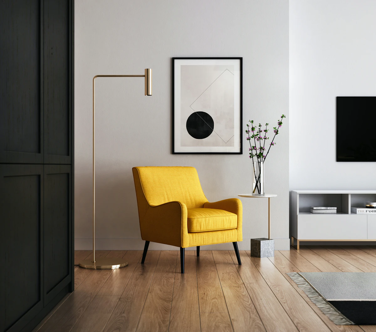
2. The Living Room: Curation with Impact
The living room is your main social and visual hub. It is the ideal place to showcase your personality and design confidence:
- Bed/Sofa Backing Alignment: If hanging art above a long sofa, the total width of the frames should cover 60% to 75% of the sofa''s width. Center the art group horizontally, and keep the lower border roughly 8 to 10 inches above the sofa back.
- Duo or Trio Layouts: Hanging two (diptych) or three (triptych) matching prints side-by-side creates a clean, symmetrical rhythm.
- Theme Direction: Expressive abstract expressionism, bold geometric designs, and contemporary landscapes work well. Learn more under Abstract Art prints.
3. The Bedroom: Prioritizing Serenity
Your bedroom is a personal sanctuary meant for relaxation. Keep the visual density low:
- Soft Palettes: Focus on soothing earth tones, muted forest greens, warm neutrals, and delicate line art. Avoid neon-bright colors.
- Bed backing wall center: Place a pair of vertical A3 or A2 frames above the headboard, or a single serene landscape. Find inspiration in our Minimalist Collection.
- Reflection Control: Always choose premium matte finishes and non-reflective acrylic covers to prevent glare from bedside lamps.
4. The Home Office: Inspiring Focus
Your workspace wall decor should stimulate cognitive focus, creativity, and clarity:
- Graphic Geometries & Architecture: Structured, clean-lined graphics, minimalist maps, or motivational typography prints.
- The Video Call Backdrop: Place a curated pair of prints on the wall behind your desk chair to create a professional and stylish view during online meetings.
Premium Styling & Sizing Matrix
Quick reference guide for choosing layouts and sizes by room size:
| Target Room | Recommended Layout | Best Frame Finishes |
|---|---|---|
| Living Room (Large Wall) | Set of 3 (Triptych) A2 vertical frames or 1 Large A1 Canvas | Matte Black, Warm Walnut, or Frameless Stretched Canvas |
| Master Bedroom | Set of 2 (Duo) A3 vertical frames with white matting | Natural Oak, Solid White wood composite |
| Foyer / Entryway | Single A2 or A1 vertical statement print | Matte Black with wide white mat board |
Featured Premium Decor

Vibrant Contemporary Abstract
Bold textures and warm pigments to anchor living room layouts.

Minimal Geometric Forms
Calm, structured sandstone tones ideal for neutral bedroom designs.
Why Shop Premium Wall Decor at Lurevi?
Lurevi takes the uncertainty out of premium interior styling. By curating contemporary works and offering professional framing, we ensure every piece meets high design standards:
- Premium Archival Matte Paper (230 GSM): Absorbs glare and provides clean details.
- Anti-Reflective Acrylic Protection: Offers a clear view without annoying lighting reflections.
- Curated Design Sets: Professionally coordinated print sets take the guesswork out of layout planning. Explore our complete directory under Art Collections or check the Art Shop.
Frequently Asked Questions
How do I choose premium wall decor colors for my living room?
Identify the dominant colors in your living room (e.g., your wall paint, sofa fabric, or area rug). Choose artwork that features at least one of these primary colors, plus a complementary accent shade to add visual interest.
What is the standard spacing for a triptych (3-piece) set?
For a clean, cohesive look, separate each frame by exactly 2 to 3 inches. If you place them too close, they look crowded; if you place them too far apart, the set loses its visual connection.
Should I choose framed prints or stretched canvas for a luxury look?
Stretched canvas prints offer a classic, textured, gallery-style appearance that works well for large abstracts. Framed prints with border mats look more precise and modern, making them perfect for line art, geometries, and fine-line photography.
Explore our related collections: Food Art, Funny Art, Painting Art